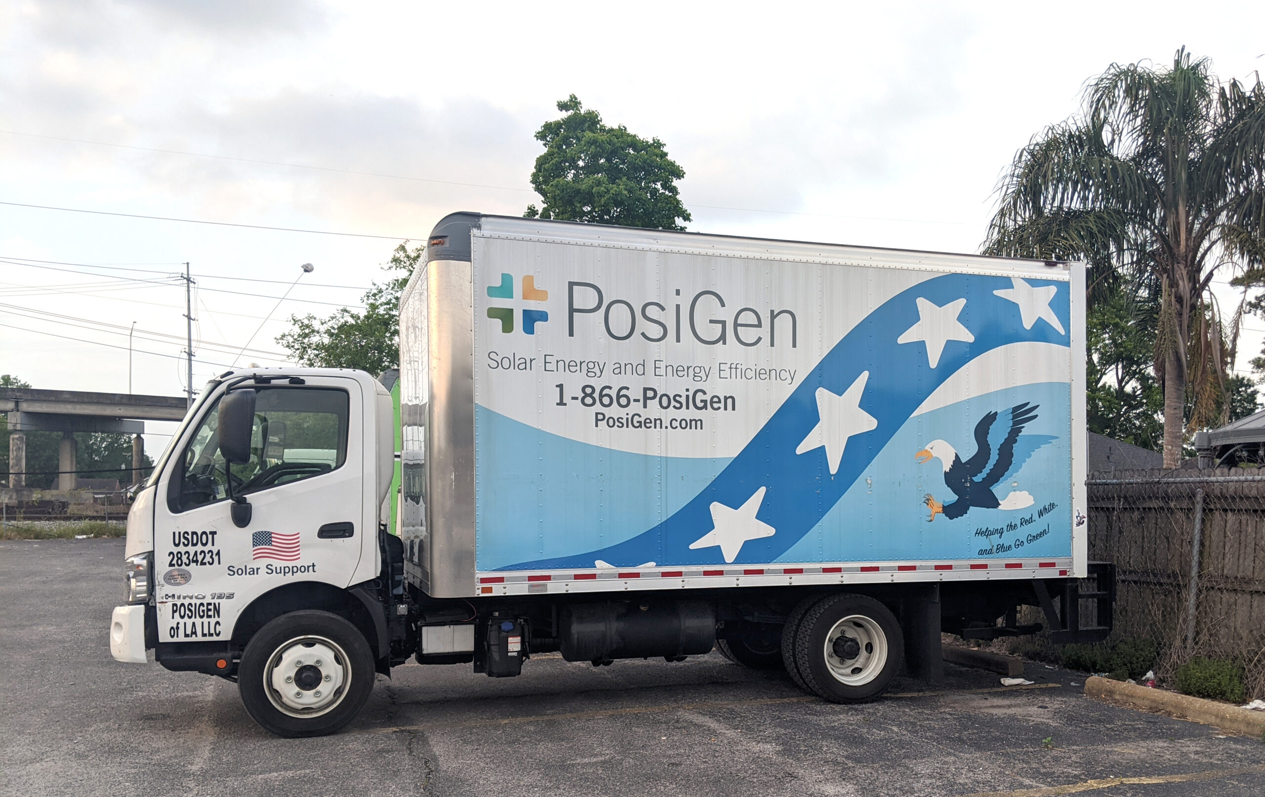
Beginning in 2018, the solar company I worked for began providing installation services for one-base housing for various military bases. With these contracts across the nation came the requirement to design a truck wrap that not only showcased the company but also aligned with the values of the projects—serving those who serve by providing solar installations to help offset energy costs. This blog post delves into the details of our design journey and the thoughtful considerations that led to the final result.
Design Requirements
When tasked with designing a service truck for army base solar installations, there were several key requirements:
- Patriotic Theme: Given the setting of the base, it was desired for the truck wrap to embody a patriotic theme, representing the values of service, duty, and national pride.
- Compelling Visuals: The design had to be eye-catching and memorable, capturing attention on the road and on-site.
- Company Information Visibility: It was essential that the company name, license, logo, and contact information were prominently displayed and easily readable, even from a distance.
- Flag Display and Eagle Symbolism: To effectively convey patriotism, the design needed to incorporate elements like the American flag, stars and stripes, and an eagle, while also adhering to proper flag display protocols.
Research and Considerations
Flag Display on Vehicles
One of the most crucial aspects of my design was ensuring the correct representation of the American flag. The U.S. Flag Code specifies how the flag should be displayed on moving vehicles:
- Orientation: The flag should appear as if it is streaming backward in the wind, with the stars in the top left corner when viewed from either side of the vehicle.
- Respect and Dignity: The flag must not be distorted or altered in any way that could be seen as disrespectful. The colors and proportions were carefully maintained to uphold these values.
For more information of displaying the flag on vehicles, see this Car and Driver article outlining the above.
Incorporating these guidelines, our truck design features a flag that flows along the vehicle’s body, maintaining both respect and visual appeal. However, this does mean that on the driver’s side door it appears to be “backwards”. This required socialization to the executive team of the U.S. Flag Code and assurance that it was the most respectful way to display the flag.

Eagle Symbolism
The bald eagle, as the national bird of the United States, symbolizes strength, freedom, and vigilance. It was personally requested by the CEO to be incorporated into the design along with the phrase “Helping the red, white, and blue go green!” To integrate these elements effectively:
- Positioning: The eagle is prominently featured on the truck, soaring across the design with its wings spread wide, conveying a sense of motion and power.
- Imagery: The eagle’s posture and expression were crafted to inspire confidence and trust, resonating with the values of those serving at the army base.
- Catch-Phrase: “Helping the red, white, and blue go green” is featured directly beneath the soaring eagle, reinforcing the symbolic connection of the eagle with the army base project.

Incorporation of Company Colors
The company’s color palette is integral to brand identity. For this design, we blended our colors with the patriotic theme to maintain consistency:
- Blue and White Stars: The stars on the design were crafted in company colors, merging seamlessly with the classic light blue gradient wave that spans the truck-a design element that featured in our classic installation truck designs. The dark blue stripe covered in white stars flows across the body of the truck, referencing patriotic bunting and giving a sense of movement as the truck drives.
- Branding: The company’s name and logo were placed in high-contrast areas to ensure they stand out while harmonizing with the overall theme. This placement allows viewers to associate the patriotic imagery with our brand effectively. It features prominently both the vanity phone number and website. The decision to use the vanity phone number was made due to the ease of remembering it when viewed briefly on the road.
Design Process

Concept Development
I began by sketching initial concepts that balanced patriotic elements with company branding. Exploring various layouts, ensuring the flag’s direction and the eagle’s position complied with our design principles and respected the guidelines that had been set forth.
Digital Mockups
Once a solid concept was formed, a digital mockup was created to visualize how the wrap would appear in real-world conditions. This stage involved experimenting with different shades and contrasts to ensure maximum visibility and appeal.
Client Feedback and Revisions
We engaged in iterative feedback sessions with various stakeholders within the company, incorporating their insights and making adjustments to better align with their expectations and mission values.


Final Design
The final truck design is a testament to the commitment to precision and creativity. Here’s a breakdown of its features:
- Patriotic Imagery: The American flag, styled with flowing stripes and bold stars, sets the tone, while the bald eagle adds a dynamic touch.
- Clear Branding: Our company name, “PosiGen,” along with our contact information, is displayed in a straightforward, readable format.
- Slogan Integration: The slogan “Helping the Red, White, and Blue Go Green!” runs across the truck, seamlessly blending with the overall theme and reinforcing our solar mission.
Conclusion
Designing a service truck for military base solar installations required a blend of creativity, respect for national symbols, and strategic branding. The final product not only meets the specified requirements but also serves as a moving testament to the company dedication to quality and service.
This project provided valuable insights into incorporating patriotic elements in branding, enhancing my ability to resonate with a diverse range of requirements.

